UX Case Study | Amie H Realtor – Solving problems with UX, not UI 

“To design is to communicate clearly by whatever means you can control or master” — Milton Glaser

1.1-intro-headerimage-v9

Good design creates a shared language, a conversation between user and interface, business and client. Conversations, however, are fluid creatures, and to be successful we have to constantly adapt to the changing tone and parameters. The Amie H Realtor project was an exercise in adaptability, as unforeseen business roadblocks unexpectedly emerged and completely reshaped the discussion and the end result.

The Objective

The Amie H Realtor project began as a website redesign for my client, a real estate agent in a small to mid-size market in Ohio. By its conclusion, the project had morphed and expanded to focus on the creation of a coherent design brand and identity across multiple platforms.

As a consulting team of one, I was simultaneously user researcher, UX designer, and project manager. I relied on Garrett’s 5 Planes of User Experience to help keep myself, and the project, on track.

Strategy

I first needed to define who I was designing for, what user needs existed and what constraints needed to be considered.
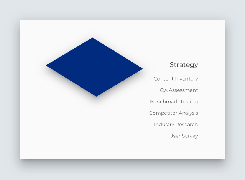
2.0-strategy

The Users

In effect, I was designing for two audiences with very different needs and goals — the agent and her clients.

2.1-strategy-two users@3x

The Agent

Amie is a knowledgeable agent with over 30 yrs experience. Having recently made the switch to a new brokerage, she wanted to take the opportunity to update her brand and personal website — which hasn’t been changed since 2013.

Amie serves homebuyers and sellers of all ages ranging from individuals to multi-generational families. Insights gleaned from industry research, surveys and benchmark testing helped me narrow in on the goals and needs common across all Amie’s clients.

The Clients

Clients are coming to Amie’s site in search of a trustworthy realtor who can help them. They want to learn more about Amie so they can evaluate her and determine if she is a good match for them.

Jenna, our persona, embodies the common frustrations and goals revealed in research. As a first-time homebuyer, Jenna is searching for a skilled agent to help guide her through the process. She needs to find a house that works for her family and her budget, but she is frustrated by all the information and jargon she has to sift through. The homebuying process is scary and overwhelming, she just wants “a real person” she can talk to, someone who is there to actually help, not just sell.

2.2-strategy-jenna-persona@3x

The Problem

The main problem I was trying to solve was how to better connect Amie and Jenna. Amie needed a website that was designed to help Jenna accomplish her goal of finding a realtor to help her through the homebuying process.

Amie’s original site had not been updated in over 5 years and was losing clients due to poor information architecture and limited functionality. Survey results and industry research revealed that most people find a realtor through recommendations from friends and family. Amie’s website and personal brand needed to “seal the deal” by clearly communicating and reinforcing the qualities she had built her professional reputation on.

2.3-strategy-brand qualities@3x

Establishing a baseline

A QA assessment and content inventory helped me understand what was working, and what was not, with the original website.

The information architecture needed the most urgent attention. Information on Amie was hidden 3-clicks deep. Page labels were misleading and not predictive of the content. In benchmark testing, users expressed confusion and frustration as they pages they clicked on did not match their expectations.

2.4-strategy-old site @3x

The visual design exacerbated the problem by impeding usability and creating slow-load times for mobile. A massive company logo in the header overshadowed the agent’s own name and pushed much of the page content below the fold. Active links were expressed in a slightly lighter grey text creating serious accessibility concerns and causing most users to miss the links altogether.

What Users Are Looking For & Where

A survey posted through the agent’s Facebook page helped me gather insight into how individuals go about finding realtors and what they are looking for when they find them.

2.5-strategy-surveyresults

Scope

Armed with this knowledge, I moved into defining the scope of the solution.

3.0-scope@3x

Research had given me a firm hold on what Amie’s users expected and needed from her site. Benchmark testing had revealed how critical searching for homes in the area was for client retention and satisfaction.

3.1-quote - find home@3x

I used a creative brief to outline what we had found and where we were headed. I then assembled a creative team to help me ideate and create a user story map before working with the client to establish an MVP line. We decided the web solution would rollout in three stages and that I would concentrate my efforts on the first stage and getting amiehrealtor.com updated and relaunched.
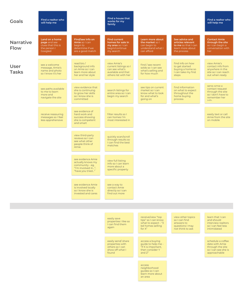
3.3-user story map @3x

Structure

With a direction set, it was time to tackle the structure needed for a viable solution.

4.0-structure@3x

There was a lot of content to work with, much of it constantly changing in both size and number — such as listings and status of available homes in the area. Its organization needed to be easy for users to understand and flexible enough to adapt to the annual fluctuations in inventory. It took me a number of iterations and prototypes before I landed on a structure that seemed to offer the needed balance.

4.1-structure-sitemapevolution-v5

Skeleton

The best way to know if your design is communicating what you intended, is to test it. So I moved into iterating and testing- building the skeleton of the site.

5.0-skeleton@3x

I began iterating wireframes with hand sketches and then moved into low-fi wireframes and prototyping.
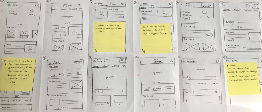
5.1-evaluatingsketches2@3x

I conducted exploratory usability tests to test concepts and flow before I was entangled too deeply in the design. By testing at this stage and keeping the focus on the information architecture, I could see if the prototype was on the right path.

It was, but it wasn’t.

The navigation system I had designed was better than the original, but still not working. Why not?

Finding a Usable Navigation — Take 1

I wanted a navigation flow and UI that would offer users the greatest visibility while giving them necessary feedback and constraining the interface to relevant choices.

The initial prototype I designed used a collapsible fixed header and tabbed subheader to communicate the site hierarchy. However, in my efforts to avoid the pitfalls of the original site, (poorly labeled pages, confusing hierarchy), I had swung too far in the other direction.

Having tabs in both the header and subheader, while usable, was unexpected to users and gave them pause. Although users quickly adapted to this structure, I knew I needed to try again.

4.2-structure-originalnav-wireframes-v2@3x
Initial iteration of the navigation system proved to have too many layers.

Finding a Usable Navigation — Take 2

After revisiting the user goals and pouring over my initial sketches and navigation iterations, I realized I was stuck. As a team of one, I had gotten trapped in a mental rut of possible design solutions. I needed a fresh injection of ideas and systems.

So, I showed my prototype to fellow designers — what did they see? What other solutions could they envision? I revisited the companies from my competitor analysis— how did they structure their sites? I pulled up the websites of a variety of companies and gathered a range of ideas on navigation possibilities.

Then, I returned to my user story map and ran 10x10s until I had a new, simplified structure.

4.3-structure-midfi-navigation
The mid-fi prototype’s navigation was much simpler and users had no trouble.

A second round of usability testing on the mid-fi wireframes and navigation was much more successful. I was feeling excited and confident as I prepared for my next client meeting with Amie. Then…

5.2-stop-full stop@3x

The conversation changes…

Two things happened nearly simultaneously.

Amie needed an IDX feed to allow her users to search all available homes in the area from within her site. Quotes from IDX feed providers came back ranging from $500-$1000+ per year, not including servicing and set up fees.

Then, her web hosting service restructured its pricing model bumping up the cost of her planned upgrade to 3x her current plan amount.

The estimated costs for the project had just jumped by over $1000 to launch and $800-$1500/per annum to continue. This was now a serious financial commitment for a small-town, commission-based real estate agent.

The Options

Research had confirmed how important having the capability to search available properties was to user retention. I reminded Amie of her original intent to better connect with potential clients and presented her with our available options.

5.3-stop-options

Project Reset

Amie decided to focus on customizing the company template site as much as we could. It meant giving up creative control over her site and the blog she had poured years into, but it would allow her to meet her clients’ need of beginning their search for a home.

New Project Mandate:

  • Customize company site as much as possible to reflect insights gleaned from research
  • Shift the project focus to creating a brand identity for Amie H Realtor that could communicate clearly across multiple platforms and mediums

Surface

With this massive shift in the focus of the project, I took a step back to recalibrate.

6.0-surface@3x

We were still trying to solve the same problem — creating a better connection between Amie and her clients — now, we were just dealing with new constraints.

The new question: Using the tools at hand, how could I apply the research to align Amie’s digital presence with her clients’ goals and needs?

Professional Website — Focus on User’s Key Tasks

Although the company template offers limited options for customization, I focused my efforts on simplifying the two key tasks users are trying to accomplish when they arrive at Amie’s site:

  1. Finding a realtor — finding information to evaluate the realtor’s skills, knowledge and services to determine if they are a good match.
  2. Finding a house — searching and filtering available properties to find a home that fits the user’s needs and their budget.

Although not the solution we had originally envisioned, the current Amie H Realtor site does offer a significant improvement over the original 2013 site.
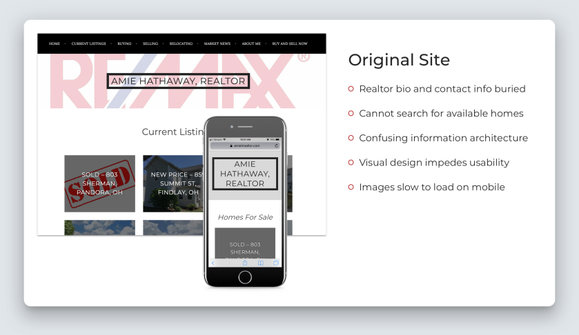
6.1-surface-original site@3x

The Current Solution

The new site puts critical information about the agent directly on the homepage. A photo, her bio and a carousel of the most recent testimonials are featured just below the property search bar giving users quick access to essential information about Amie.

6.2-surface-current site@3x

I reordered and simplified which of the company pages were displayed in navigation. I renamed the pages according to labels and terms that tested well with users so that homebuyers and sellers could find relevant information more efficiently.

The Amie H Brand— Focus on consistency

Amie maintains a digital presence on her website, Facebook, LinkedIn as well as running print ads regularly. Amie added these tools to her repertoire over the years; but she had never outlined why she used them or how best they could help her communicate with clients.

6.3-quote - amie@3x

Consistency is key to building trust. Wildly inconsistent tone, branding, voice and content across and within platforms undermines the core of Amie’s brand.

The Solution

With so many mediums and their particular constraints in the mix, it is essential that Amie’s brand be consistent and communicate effectively, no matter the platform.

I facilitated a brand identity workshop with Amie to identify key brand messages. Using the insights from that meeting, I created a brand identity & style guide that clarifies Amie’s brand values and what she is trying to communicate.

6.4-style guide v3@3x

The guide offers clear guidelines on color, image selection, voice and content. It creates a style that distinguishes the personality and tone of the Amie H Realtor brand from other agents. The section on Voice digs deep into each of the platforms, outlining the purpose of the tool for the brand and how it can best leveraged to connect with clients and support their goals.

Amie’s brand helps her connect with potential clients by emphasizing messages of trustworthiness and reliability — the top attributes users are looking for in a realtor.

6.5-surface-qualities@3x

Measuring Success

Since the website and new branding guidelines just launched in January 2019, reliable industry metrics and analytics aren’t available yet. There are still later phases of the project to roll . However, initial tests on the website show a marked improvement in efficiency and usability.

Summary

The Amie H Realtor project taught me a lot about the necessity of adaptability in real-world environments but also the importance of good research. When you hit a roadblock, whether it’s creative (as I did with the prototype navigation system) or business-related (as with the unexpected jump in costs), it’s important to step back, recalibrate and adapt.

By returning again and again to the user and the insights from the research, I was able to reorient myself and tackle the problem from a new angle. Although the end product is leagues away from the solution I envisioned, it is helping the users, and the agent, reach their goals faster and more intuitively.

6.6-summarypanel@3x

Please reach out to me if you’d like to know more about the Amie H Realtor project, its research or future plans. I would love to connect on LinkedIn or at shathaway.ux@gmail.com!


UX Case Study | Lighthouse – Helping users meet face-to-face 

Header image with the app slogan - "Find the party. Be the party."

“I’ve learned that people will forget what you said, people will forget what you did, but people will never forget how you made them feel.”- Maya Angelou

Humans crave belonging: being able to identify with others, form relationships, be a part of the group. At one time, belonging to a group was essential to human survival. And if you recall any part of high school, you’ll know it is still hard-wired into our behavior today.

In recent years, the Fear of Missing Out, or FOMO, has gained traction in media discussions. Apps like Instagram and Snapchat provide you with a never-ending stream of your friends’ parties and vacations. This constant bombardment of images and quotes from events you’ve missed can lead to feelings of being left out and overlooked.

Objective : Create an events-based app

The goal of our project was to address the fear of missing out through an events-based app. Users needed to be able to mark their locations and automatically invite their friends to join them.

I led a cross-functional team of two developers and three UX designers. In three weeks, we needed to design and build a mobile iOS app that would allow users to create events, add friends, and share locations.

Panel image of the 5 members in our team.
Our team consisted of developers (Owen & Levi) and UX Designers (myselfNaomi, & Chris)

Charting a course

Communication is critical on a team. To help, we established a collaborative decision making process. Whole-team consensus was the goal, but two votes out of three could carry a decision. If our developers needed changes, a minimum of two designers had to be involved in the discussion. All decisions were documented in a shared file. In the event of a dispute, it was my responsibility as Team Lead to make a decision and move the team forward.

Image of our first team meeting at a coffee shop.
Coffee, pastries and wireframes = brilliant team bonding.

I held daily design scrum meetings to prioritize the day’s work. These were followed by whole team standup meetings with our developers. As a group, we set a project timeline with milestones and handoffs.

Involving the developers from day one was incredibly helpful. They provided immediate feedback on the feasibility of our designs and volunteered useful ideas of their own.

Research —Gathering data

Given our limited timeline, we jumped immediately into Agile UX Design. After listing our assumptions, we built a research plan to address the gaps in our knowledge.

Image of our key research questions including who are our users? What are their typical behaviors when going out? What environments and contexts are involved? How interested are they in knowing where their friends are and what they're doing? How important is being included to our user? How important is being included to our user?

Surveys & Interviews

Using surveys and contextual interviews with individuals between the ages of 18–35, we quickly discovered two important points.

Discovery 01 — Our primary audience has a much narrower age margin than anticipated.

Our data revealed a huge difference in motivations between individuals aged 18-25 yrs and individuals aged 25–35 yrs. 18–25 year olds expressed 100% interest in a tool that would allow them to broadcast their location to their friends. 25–35 year olds expressed exactly 0% interest. From this, we narrowed our scope to individuals ages 18–25, with a concentration on college students.

Discovery 02– 18 to 25 year olds are primarily motivated by relationships.

25–35 year olds are more often motivated to go out based on the type of event happening. They arrange their plans ahead of time and prefer to invite specific friends instead of sending out a general invitation to all their friends.

Panel of event vibe icons users can choose from when they drop a pin.
Users can select an event vibe when they drop a pin — movies, bar, food, club, concert, party, chill or studying.

18–25 year olds differ drastically. As young adults, they are often newly independent and focused on making and maintaining new relationships. When selecting activities, they base their decisions first on who is going to the event rather than what type of event it is. They prefer to go out with known friends and are unlikely to go to an event without knowing at least one other person there.

This data contradicted the original project assumption that the app should be events-based. We realized that knowing which of their friends were there, — that was the primary motivator for our users.

Our User

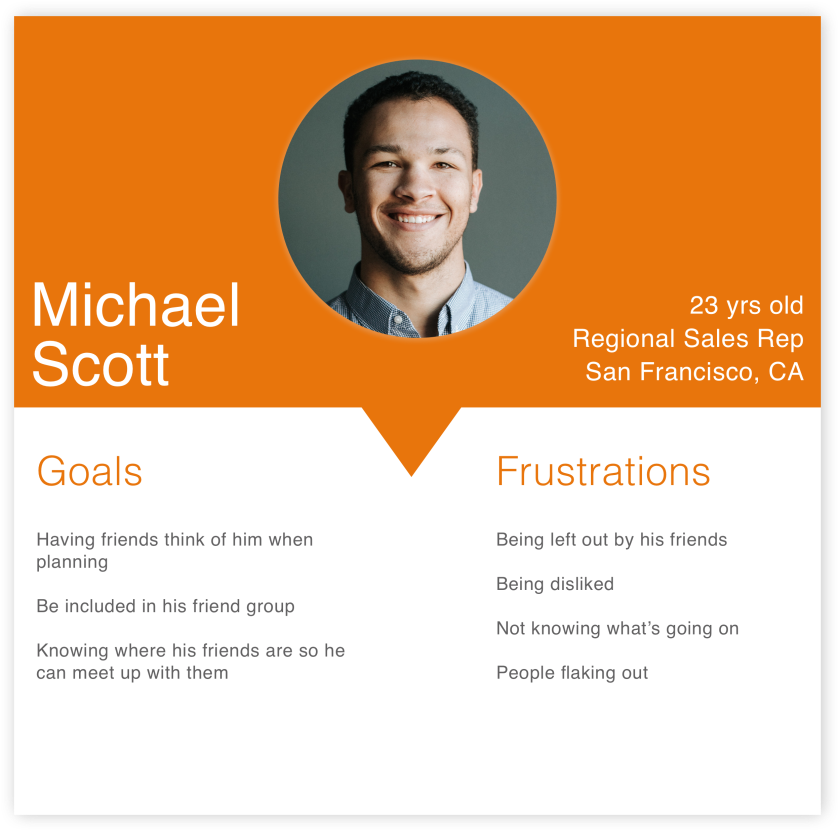
Our user is 23 years old and is primarily motivated by friendship and relationships.
Friends and relationships are the primary motivator for Michael.

Competitor Analysis

Panel of our key competitors' logos.
Foursquare, Apple’s Find My Friends, Snapchat, and Swarm are key competitors.

Competitor benchmark testing on Foursquare revealed that speed of use is especially important to our users in two ways. Users want to (1) quickly scan which of their friends are available to meet up, and (2) connect with those friends as fast as possible. Our product would need clear hierarchy, clean design and friendly copy to help them accomplish that goal.

Define

The MVP: find friends | bring friends to you

We created a story map for the user’s journey through our product. The key tasks users needed to be able to accomplish were:

  • Find and view friends on the map
  • Invite friends to your location
Image of initial wireframe sketches.
Wireframing helped me understand which views would be needed.

To do this, users had to be able to add friends and then find them again in the friends list or on the map. They also needed to be able to mark their location and start- or stop- sharing that location at will.

Because this was an Agile environment, only the essentials would be built in the initial version. Extra features like in-app messaging, global heatmaps, and venue information were moved to later releases.

Having our developers involved as active participants saved the team valuable time. They helped account for views we had overlooked and balance the user experience with the back-end needs of the app.

Ideate, prototype, test

We started building wireframes and conducting initial usability testing. Feedback from these tests helped refine the app in general, but our onboarding in particular needed work.

Onboarding — Balancing time, permissions and asks

We had two hurdles to get over in the onboarding experience: timing and creating an account.

Image outlining the two main hurdles to get over in our onboarding flow: timing and account creation.

We changed the onboarding flow numerous times to balance an engaging experience with the time the app needed to call the correct location map. Initially, we had a launch screen, followed by a location permissions request. Eight seconds into the first usability test, we realized our error.

Although our app was targeted at digital natives, we still needed to prime them to accept the location request. Users immediately stopped at the permissions request saying, “I don’t even know what the app does yet.”

We added a screen explaining what the app does, and a coachmark to encourage them to allow location permissions. We tested again, but feedback showed the request was still too soon.

Next, we expanded and split up the onboarding to meet the timing needs of the app while still giving users more information. A short 3-screen tour after launch showcased the top features of the app. Pre-permissions copy clarified why users want to allow location tracking. Strategic button placement primed them to select the correct option.

Panel of high-fidelity mockups as shown in the iPhone 8.
High fidelities of our third iteration of the flow leading up to the location permissions request.

Introducing “create an account”

Originally, after allowing location tracking, users were sent to setting up an account. In testing, this again proved too soon. Having a second ask immediately after asking for location tracking stretched user engagement to the point of breaking. They needed more — both time and value.

We adjusted and had users land on a global heatmap from location permissions. From here, they would be able to see nearby hot spots — areas where the most Lighthouse users were hanging out and dropping pins. However, in order to drop their own pins and find friends, they would have to sign up.

Satisfied we had resolved our flow issues, we tested again. The onboarding part went much better (with the minor exception that no one actually read any copy). Then, our devs came back with some unfortunate news — the global heatmap wouldn’t be ready in time for launch, it would have to come out.

Back to the drawing board.

Hand-drawn flow chart of the main events in onboarding, with revisions.
With the heatmap out, we had to devise a new plan.

Adjusting to new constraints

How could we space out the requests for information while still keeping the user engaged in the process? We no longer had a heatmap, what else could we do that would provide value and an opportunity for interaction?

Throughout the app, we used a drawer to display important, relevant information. In testing, users often missed the drawer completely or did not realize it was moveable.

We replaced the global heatmap with a map screen with the simple coachmark “swipe up to get started.” When users swiped up, the drawer was raised and users could see the sign up call-to-action (CTA). This began the learnable pattern of finding important information in the drawer. We reinforced this pattern with an “Add Friends” CTA in the drawer after creating a profile. In the logged-in map view, the drawer allows users to view and access a full list of their friends and invites.

Worried that onboarding had become too long, we tested again. But, users swiped through the tour and tapped through the permissions in seconds.

High-fidelity mockups as shown in iPhone 8.
High fidelities of the final flow introducing and reinforcing the concept of the drawer.

High fidelities of the final flow introducing and reinforcing the concept of the drawer.

Why did this work?

Users were now moving through onboarding so fast, they were only absorbing a word or two before reaching the permissions request. Interestingly, although they weren’t reading all the words, they were now much more likely to allow location access. Why?

When those screens weren’t there, users shied away from granting permission. Having those screens, and the choice to ignore them, gives users a sense of control.

The repetitive micro-interactions build users’ confidence in their ability to navigate the app. The onboarding tour creates a pause that allows users to get used to this new environment. As a result, they are more willing to allow us to use their location and sign up for an account.

Clean and scannable interface design

We created a style guide that emphasized a clean, scannable look. This would help users accomplish their tasks quickly.

Glimpse of Lighthouse style guide showing colors, tone, fonts and icons.

Lighthouse is a fun, energetic app. Orange’s connections with energy, vitality and youth made it a perfect primary color. We used it throughout the app to call attention to CTAs and clickable content.

Early on, we had a dark blue as a secondary color to draw on the idea of water and light (lighthouse). We soon discovered that the hues we had chosen were competing with one another because they carried the same visual weight. We dropped the blue in favor of maintaining a light look with more white space.

Dropping blue also helped us address some accessibility concerns we had. We used Stark, a Sketch plugin, to simulate what our designs would look like seen through various types of color-blindness.

Color alone wasn’t enough to differentiate between active and inactive states. We employed size, weight and other visual clues to help distinguish changes in state. Different icons and sizes help users identify their pin from their friends’ locations.

Summary

Lighthouse is a friends-based app that allows you to find your friends’ current locations, drop a pin in your location and automatically invite your friends to join you.

Video recording of the initial onboarding sequence in Lighthouse.“People first” was the main theme for both the final product and the process of creating this app.

Emphasizing friends and relationships in the product design was key for our primary audience. We gave users multiple paths to adding and finding friends. We kept the design clean and light to allow users to scan quickly and find their friends.

I worked hard to create a strong culture of “people first” within our team. We worked closely with our developers, sharing desk space and taking them on the user journey with us. As a team, we produced better designs and a better product by creating a supportive environment.

The developers saved us more than once from wasting valuable time heading down the wrong path. In turn, they became more deeply invested in the product and its design. They had a clearer idea of where we were heading and were able to build the right product out the first time. The product, and the people, benefitted.

Please reach out to me with any questions you may have about Lighthouse! I can be found on LinkedIn or at shathaway.ux@gmail.com.

Download Lighthouse from the app store today!

UX Case Study | Rememory – Accessing memories

Header-Rememory@3x

“We keep moving forward, opening new doors, and doing new things, because we’re curious and curiosity keeps leading us down new paths.” — Walt Disney

The human mind has a vast capacity for memory and creativity. Memories shape who we are, the questions we ask, and the doors we open. When our memories begin to slip away or fail us, the resulting loss touches all those we love.

An estimated 5.7 million Americans are currently living with Alzheimer’s or dementia; a number projected to increase to roughly 14 million by 2050 (Alzheimer’s Association). Alzheimer’s and other types of dementia interfere with memory, thinking and behaviors and cause a decline in thinking skills severe enough to reduce a person’s ability to perform everyday activities (Alzheimer’s Association).

Objective — Help with memory access and recall

The goal was to design a responsive mobile application which provided paths and strategies for memory recall.

We had two weeks to complete product research as a team before we would split to produce four independent design solutions.


The Process @3x

Empathize

There were a number of paths we could have pursued — should we focus on memory recall strategies? Address emotional needs? Provide guides for navigating daily interactions with individuals with memory impairment?

I was curious about our target population. What were their goals, pain points, and daily activities? First, I led the team in listing our assumptions and drafting a research plan to focus our inquiry.


ResearchQuestions@3x

What are our users experiencing?

We posted a survey to Memory People, a Facebook support group for caregivers. We wanted to know more about their experience, so we asked:

  • “In caring for your loved one, when do you feel successful?”
  • “What is most enjoyable for you as you help your loved one? most difficult?”
  • “When do you feel most connected with your loved one?”
  • “What mediums do you use to regularly capture memories?”

We conducted 11 interviews, ranging from physicians and community advocates/organizers to individuals currently living with Alzheimer’s. These interviews, combined with the survey data and competitor analysis, helped to paint the full picture.

Photo of two women sitting on a bench together, illustrating that there is another person in the picture of Alzheimer’s — the family caregiver.

Distilling our findings

01 — Our demographic group has a limited relationship with technology.

Individuals diagnosed with Alzheimer’s or dementia are typically between the ages of 60–90+ years. They have a very different relationship with technology and may or may not own a computer or mobile device.

02 — The nature of dementia prevents most patients from using technology without assistance.

Early in the onset of dementia, typing out a text message becomes a nearly impossible task.

A digital tool wasn’t necessarily going to be a useful solution. However, it could benefit the other person in the picture — the caregiver.

03 — Focus on the family caregiver.

Our data revealed that most caregivers are family members, typically a child between 40–70 yrs old. They face the task of caring for their loved one, managing their own lives and navigating the complex emotions surrounding the disease.

Define

What is already available in the market?

We reviewed competitor websites, apps and blogs, such as the Alzheimer’s AssociationNational Institute on AgingAlzheimer’s Disease Pocketcard and Alzheimer’s Daily Companion.

However, the preservation of shared memories was an aspect missing from our competitor’s tools.

Getting to know our user

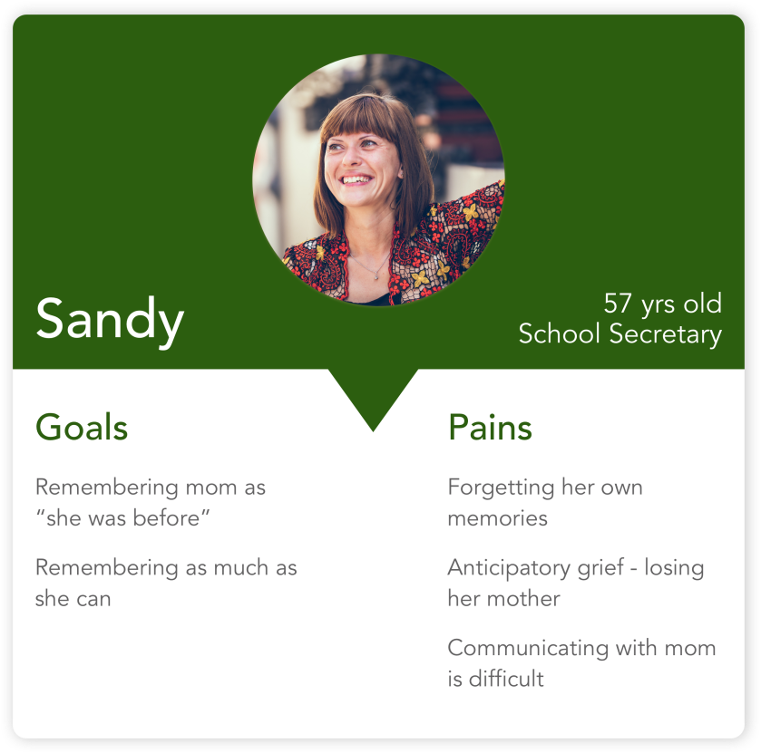
Synthesizing the data, our primary persona emerged — Sandy Priest.


Sandy@3x.png

The New Objective

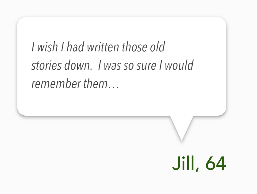
None of our competitors were providing a solution for Sandy’s need to capture and organize memories of her mom.

This was our opportunity.

Build a digital tool that will help individuals capture, organize and access memories of their loved one(s).

Quote-Jill@3x


Ideate

Creating a usable design

Image of my hand-drawn site map for Rememory.
Hand-drawing a site map helped me work through user flows.

After establishing a user story map and MVP, our team diverged to develop our own designs.

My designs refined the MVP to keep the focus on the act of saving and accessing memories. Once signed in, users land on a dashboard where they can add memories or interact with previously uploaded memories. Users can also access memory prompts that have been fine tuned for use with those with loved ones in the early stages of memory loss.

Streamlining the MVP and creating a site map outlining the new user flow helped clarify what views and functionality were needed. I got to work wireframing and prototyping.

Designing for Sandy

Research showed my primary audience typically limited their phone use to talk, text and navigation directions. Tablets were the preferred platform for internet browsing and engaging with web-based tools. I focused on designing for the iPad while keeping Sandy’s design considerations in mind.

Prioritizing user tasks

The dashboard was the most difficult view to create.

While the landing page had the clear purpose of communicating product value and directing users to sign in/ sign up, the dashboard was another story. It had paths heading to all the different destinations a user could access in the product.

As my designs became cluttered, I took a step back to analyze what users were trying to accomplish on the dashboard.

Image illustrating the correlation between the organization of the dashboard and the hierarchy of tasks users are trying to perform.

Lesson Learned — Test early and test often.

At this point, I should have stopped and conducted a full round of usability testing on the low-fidelity designs to ensure I was on the right path.

I made the mistake of thinking I had to have a fully working prototype before I could begin serious usability testing. If I had done more usability testing at this point, I could have refined my understanding of how my users interacted with technology before moving into visual design.

Prototype

My users would most likely be coming to this tool in a time of stress and with a stronger apprehension of technology than millennials. My visual design needed to be calm, stable and supportive. I chose green as my primary color because of its association with the ideas of growth, rebirth, and trees — in particular the family tree.

A snapshot of Rememory's style guide showing colors, fonts and a few icons.

I used color selectively, preferring plenty of white space, to keep the visual focus on uploaded images.

I chose Avenir for the body font because of its clean look and ease of readability. IBM Plex Serif brought a touch of elegance and nostalgia to the headlines. I kept my font sizes large to ensure accessibility.

I continued to adjust and refine my designs based on feedback in usability testing. My landing page and onboarding went through a number of iterations to finalize the best solution.

Refining the landing page

In usability testing, users felt apprehension. The Get Started button on the landing page triggered resistance.

“I don’t want to get started, I don’t know what I’m signing up for yet.”

Users wanted to know more about the product before signing up. I prioritized the action of “Learn More” to help users get the information they needed to feel comfortable.

Progression of Homescreen@3x

Onboarding — Balancing hand-holding and independent discovery

Testing also showed that my primary audience wanted a more detailed, “hand-holding” onboarding experience. However, my secondary audience, Sandy’s son and other family members, wanted to be able to skip over lengthy onboarding requirements and just explore.

To balance the needs of both, I designed an experience that could be skipped out of at any point, but would otherwise provide a high level of support. This had the added benefit of ensuring that my primary audience didn’t land on an empty dashboard at login by walking them through uploading their first memories.

Testing — Revelations

Testing in low-fidelity yields different results than testing in high-fidelity. In high-fidelity testing, users expect full functionality from the product. This can be problematic if you want to test information hierarchy or a specific functionality. Paper prototyping and low-fidelity testing helps keep the user focused on the functionality and flow of the product instead of the color choices and continuity of fill images. Both types of testing are useful, but knowing the differences between user expectations can help you wield the two types of testing more effectively.

Testing with seniors comes with unique considerations. I had not anticipated the level of anxiety and fear of “breaking it” that would arise for users, even during testing in a closed prototype. I had to adjust my approach completely and spend more time reassuring users there was no possible way they could break anything. Changes in the labels and navigation layouts were helpful in reassuring users they were on the right path.

Rememory Features@3x

Summary

The curse of being a designer is that nothing will ever be perfect, you will always see something you want to fix. Our curiosity leads us to open new doors and explore new paths, but it also makes it hard to stop opening doors when the project is done.

If I were to design Rememory again, I would experiment with different navigation systems. Because of the limited pixel space on an iPad, I relied on a hamburger menu and back arrows. During usability testing, one user pointed out that “I like having a back arrow on every page — I always want a way out.” Breadcrumb navigation or a top nav bar may have helped users feel more comfortable.

This project challenged me to grow in new and unexpected ways, both in my designs and my personal approach to UX. The intense emotions provoked by memory loss gave this project extra weight. It showed me the importance of gentleness, humility and genuine curiosity in user interviews and usability testing.

Listening — really listening — can lead to the most unexpected discoveries and being curious will lead you to new paths you could never have anticipated.

Video recording of accessing the memory tips in Rememory

Please reach out to me if you’d like to know about Rememory. I would love to connect on LinkedIn or at shathaway.ux@gmail.com.

Want to learn more about Alzheimer’s or dementia? The Alzheimer’s Association is a great place to start.